2011-06-23 10 views
5

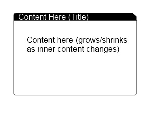
Estoy tratando de crear algo similar a la imagen de abajo en WPF. Este control está diseñado para ser la vista base de todo en mi aplicación y estará sentado dentro de un control de ventana con un fondo (probablemente un gradiente de algún tipo).WPF elemento de esquina recortada

Los requisitos son los siguientes:

  • esquinas redondeadas en tres lados (arriba a la izquierda, inferior izquierda e inferior derecha)
  • Corte la pestaña de esquina mirando en la parte superior derecha que tiene el fondo detrás de la " área de corte "transparente para que se muestre el degradado del fondo de la ventana" (haciendo que parezca cortado)
  • El área del título debe ser un contenedor de contenido para poder poner cualquier elemento dentro, como iconos y texto
  • Área de contenido necesita tener un mínimo altura y luego crecer si el contenido interno lo excede (no sobre la marcha - solo soporta la altura de los elementos que contiene)

He estado peleando con esto durante horas, pero siendo nuevo en WPF ' Estoy empezando a encontrarme corriendo en círculos. Creo que hay grandes beneficios para la flexibilidad de WPF, pero para las personas que recién comienzan es casi demasiado desalentador.

¡Cualquier ayuda sería muy apreciada! ¡Gracias!

Content Layout

Respuesta

4

Tabby

No sé cómo 'llenar' el clip, así que hice el clip en código. Que me haga saber si necesita más ayuda para añadir más propiedades para controlar los colores etc. aquí va:

Código:

public class Tabby : HeaderedContentControl 
{ 
    static Tabby() 
    { 
     DefaultStyleKeyProperty.OverrideMetadata(typeof(Tabby), new FrameworkPropertyMetadata(typeof(Tabby))); 
    } 

    public double DogEar 
    { 
     get { return (double)GetValue(DogEarProperty); } 
     set { SetValue(DogEarProperty, value); } 
    } 

    public static readonly DependencyProperty DogEarProperty = 
     DependencyProperty.Register("DogEar", 
     typeof(double), 
     typeof(Tabby), 
     new UIPropertyMetadata(8.0, DogEarPropertyChanged)); 

    private static void DogEarPropertyChanged(
     DependencyObject obj, 
     DependencyPropertyChangedEventArgs e) 
    { 
     ((Tabby)obj).InvalidateVisual(); 
    } 

    public Tabby() 
    { 
     this.SizeChanged += new SizeChangedEventHandler(Tabby_SizeChanged); 
    } 

    void Tabby_SizeChanged(object sender, SizeChangedEventArgs e) 
    { 
     var clip = new PathGeometry(); 
     clip.Figures = new PathFigureCollection(); 
     clip.Figures.Add(
      new PathFigure(
       new Point(0, 0), 
       new[] { 
        new LineSegment(new Point(this.ActualWidth - DogEar, 0), true), 
        new LineSegment(new Point(this.ActualWidth, DogEar), true), 
        new LineSegment(new Point(this.ActualWidth, this.ActualHeight), true), 
        new LineSegment(new Point(0, this.ActualHeight), true) }, 
       true) 
     ); 
     this.Clip = clip; 
    } 
} 

Generic.xaml

<Style TargetType="{x:Type local:Tabby}"> 
    <Setter Property="Padding" 
      Value="5" /> 
    <Setter Property="Template"> 
     <Setter.Value> 
      <ControlTemplate TargetType="{x:Type local:Tabby}"> 
       <Grid> 
        <Grid.RowDefinitions> 
         <RowDefinition Height="auto" /> 
         <RowDefinition Height="auto" /> 
        </Grid.RowDefinitions> 
        <Border CornerRadius="3,0,0,0" 
          BorderBrush="Black" 
          BorderThickness="1" 
          Background="Black"> 
         <ContentPresenter Content="{TemplateBinding Header}" 
              Margin="{TemplateBinding Padding}" /> 
        </Border> 
        <Border CornerRadius="0,0,3,3" 
          BorderBrush="Black" 
          BorderThickness="1" 
          Background="White" 
          Grid.Row="1"> 

         <ContentPresenter Content="{TemplateBinding Content}" 
              Margin="{TemplateBinding Padding}" /> 
        </Border> 
       </Grid> 

      </ControlTemplate> 
     </Setter.Value> 
    </Setter> 
</Style> 

Su uso:

<my:Tabby DogEar="12" 
      x:Name="tabby1"> 
    <my:Tabby.Header> 
     <TextBlock Foreground="White">Header</TextBlock> 
    </my:Tabby.Header> 
    <my:Tabby.Content> 
     <TextBlock Text="Content can be anything" /> 
    </my:Tabby.Content> 
</my:Tabby> 
+0

¡Perfecto! Esto está muerto en lo que necesitaba. Ahora la única pregunta que siempre parece haber resurgido de WPF ... ¿cómo en el mundo aprendiste a hacer lo que hiciste? Los recursos para realmente aprender WPF en formas útiles como esta parecen tan increíblemente escasos como parece. – RubyHaus

+0

Hace cinco años hice la parte difícil en la que estás ahora. Leí los libros, codifiqué proyectos múltiples, cometí errores y pregunté a otros (no había tantos por entonces, pero tuve la suerte de tener acceso a algunas de las personas que trabajaban en WPF). Y aún ahora todavía estoy aprendiendo. Espera, llegarás allí. –

4

Pruebe lo siguiente para comenzar:

<Grid Width="100" Height="100"> 
    <Border Background="Green" CornerRadius="8,0,8,8"> 
     <Border.Clip> 
     <PathGeometry> 
      <PathGeometry.Figures> 
      <PathFigure StartPoint="0,0"> 
       <PathFigure.Segments> 
       <LineSegment Point="90,0"/> 
       <LineSegment Point="100,10"/> 
       <LineSegment Point="100,100"/> 
       <LineSegment Point="0,100"/> 
       </PathFigure.Segments> 
      </PathFigure> 
      </PathGeometry.Figures> 
     </PathGeometry> 
     </Border.Clip> 
    </Border> 
    </Grid> 
+0

¡Creo que esto será perfecto! ¡¡Gracias!! – RubyHaus

+0

Su método funcionó bastante bien, pero la respuesta a continuación (el control "Tabby") terminó trabajando mejor para mí ya que necesitaba algo fácilmente reutilizable. Sin embargo, dejé mi voto por ti. ¡Gracias de nuevo! – RubyHaus

+0

Comencé así también, pero pronto me quedé atrapado cuando no sabía el tamaño del control y tuve que deducir el tamaño del Clip. –

0

Aquí hay un código que arme el uso de un control personalizado.

Código de control:

using System; 
using System.Windows; 
using System.Windows.Controls; 

namespace Test 
{ 
    public class ContentCard : HeaderedContentControl 
    { 
     static ContentCard() 
     { 
      DefaultStyleKeyProperty.OverrideMetadata(typeof(ContentCard), new FrameworkPropertyMetadata(typeof(ContentCard))); 
     } 
    } 
} 

xaml de control (en la carpeta Themes/Generic.xaml)

<ResourceDictionary xmlns="http://schemas.microsoft.com/winfx/2006/xaml/presentation" 
        xmlns:x="http://schemas.microsoft.com/winfx/2006/xaml" 
        xmlns:test="clr-namespace:Test"> 
    <Style TargetType="{x:Type test:ContentCard}"> 
     <Setter Property="Template"> 
      <Setter.Value> 
       <ControlTemplate TargetType="{x:Type test:ContentCard}"> 
        <Grid Background="Transparent"> 
         <Grid.RowDefinitions> 
          <RowDefinition Height="30" /> 
          <RowDefinition Height="*" /> 
         </Grid.RowDefinitions> 
         <Grid.ColumnDefinitions> 
          <ColumnDefinition Width="*" /> 
          <ColumnDefinition Width="20" /> 
         </Grid.ColumnDefinitions> 

         <Border Grid.Row="0" Grid.Column="0" Background="{TemplateBinding Background}" CornerRadius="10,0,0,0" Height="30"> 
          <ContentControl Content="{TemplateBinding Header}" VerticalAlignment="Center" Margin="10,0,0,0" /> 
         </Border> 
         <Path Grid.Row="0" Grid.Column="1" Fill="{TemplateBinding Background}" Data="M0,0 L20,15 L20,30 L0,30 L0,0Z"/> 
         <Border Grid.Row="1" Grid.ColumnSpan="2" BorderBrush="{TemplateBinding Background}" BorderThickness="1,0,1,1" CornerRadius="0,0,10,10" Padding="5" Background="White"> 
          <ContentControl Content="{TemplateBinding Content}" /> 
         </Border> 
        </Grid> 
       </ControlTemplate> 
      </Setter.Value> 
     </Setter> 
    </Style> 
</ResourceDictionary> 

Ésta es la forma en que lo utilice:

<test:ContentCard Grid.RowSpan="4" Grid.ColumnSpan="2" Margin="200" Background="Black"> 
    <test:ContentCard.Header> 
     <TextBlock Text="Title" Foreground="White" /> 
    </test:ContentCard.Header> 
    <test:ContentCard.Content> 
     <TextBlock Text="This is some content" Foreground="Black" /> 
    </test:ContentCard.Content> 
</test:ContentCard> 
Cuestiones relacionadas